Sample blog. These entries are placeholders so the pages can be reviewed. Nothing here has happened yet, and the blog is kept out of search until real posts replace it.
What Braille on a picture book really takes
Embossing a book that is already printed in full colour changes the paper, the binding and the page plan. Here is what we learned putting Braille on all nine titles.
- Published
- Written by
- Aida Ismail
- Length
- 8 min read
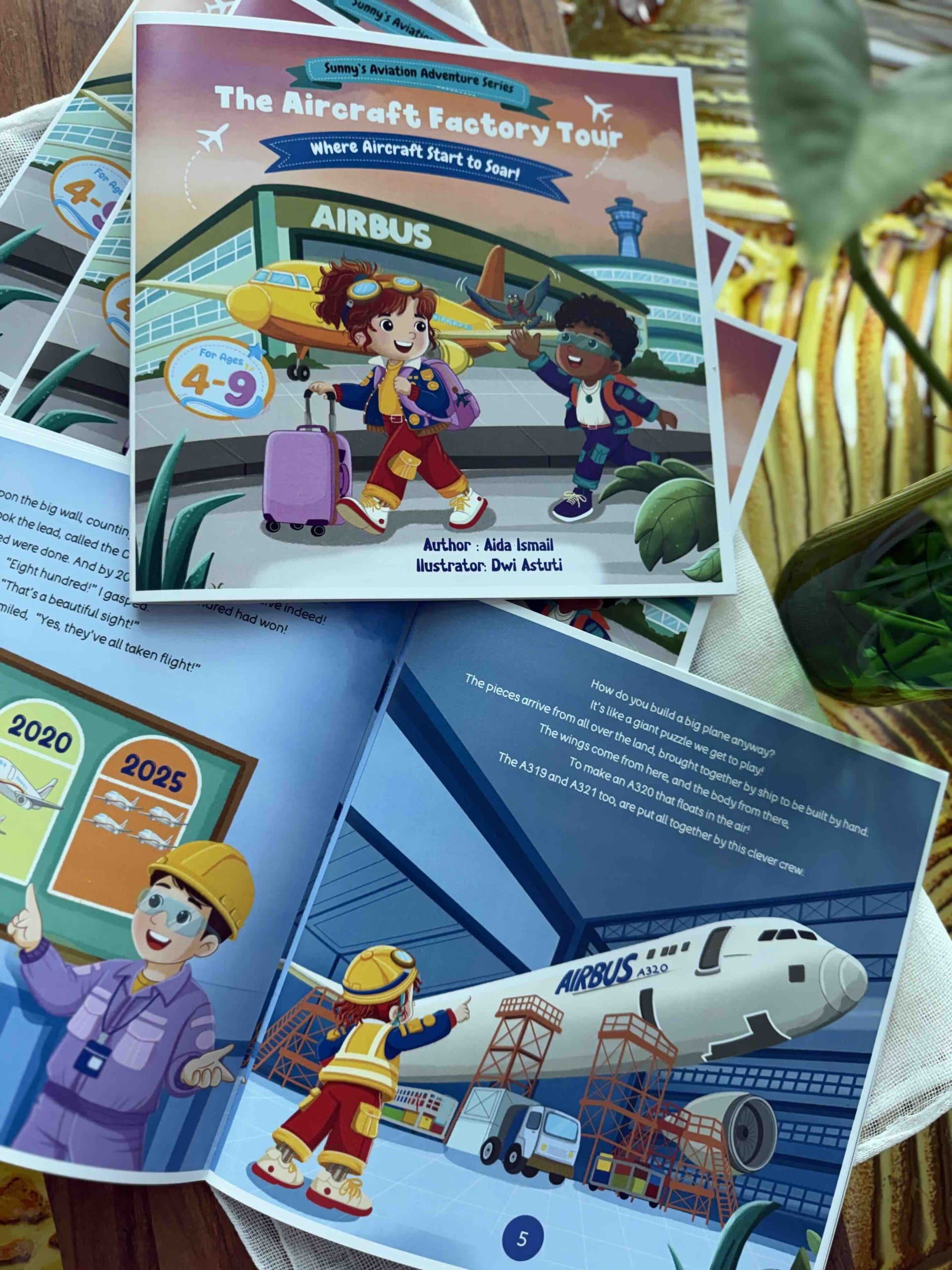
The decision was easy and the production was not. Every Sunny title carries embossed Braille, and adding it to a full-colour picture book changes almost every choice made before it.
Paper first. Embossing needs stock heavy enough to hold a dot through handling by a five year old, and colour printing wants a surface smooth enough not to scatter ink. Those two requirements pull in opposite directions.
Then the page plan. Braille takes far more room per word than print, so a line that sits comfortably under an illustration in one system runs off the page in the other. Several spreads were redrawn to make room.
Binding was the last surprise. A book that is opened flat and read by touch takes more abuse at the spine than one that is only looked at.
None of this is a reason not to do it. It is a reason to plan it from the first sketch rather than adding it at the end, which is the mistake we made once and only once.
Written by Aida Ismail
Founder and author
Updated
- Accessibility
- Production